The person who knew the machine
How we rebuilt a B2B configure-price-quote platform that only worked when the right person was in the room, and why the screens were the easy part.
A product that could do everything, and still lost
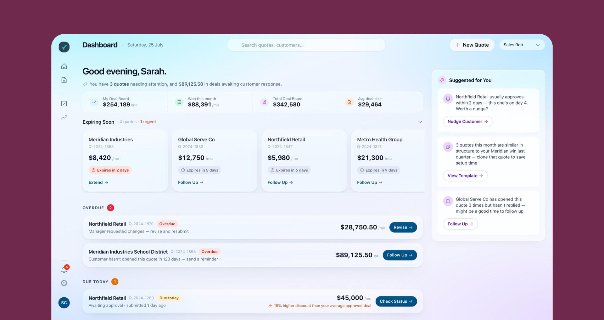
It was a B2B quoting platform, the engine enterprise sales teams live in to configure a deal, price it, get it approved, and send it. On paper it did all of it. Every pricing model, thousand-line quotes, multi-currency, ramp deals, approvals that route by region. Ask it a feature question and the answer was almost always yes. It kept losing evaluations anyway. An outside review, before the project started, named why in one line.
“The problem was never the feature list. It was the way the whole thing was pointed.”
The platform had been built by engineers with billing backgrounds, and the screens showed it. They matched the shape of the database, not the shape of a sale. A rep didn't move through the software the way they moved through a deal. They traveled around it, screen to screen, collecting what they needed and holding the rest in their head.
The cost was being paid by people, not the system
Picture a small team that has run its whole business on this platform for over a decade. The same handful of people the entire time. They call themselves the product's biggest fans, then list a dozen serious problems without pausing. They keep hundreds of old products they can't clear out, because there's no safe way to delete them. They place orders by hand, because they can't hide the fields that don't apply. Then the thing that makes all of this dangerous actually happens.
“The person who checked our invoices every month left, and nobody took it over. We didn't catch it for a while.”
A billing error ran unnoticed, and the platform never said a word, because nothing in it was watching. This is not an edge case. It is the design working as built. Another customer, someone who wires his own automations into the system, was asked what he'd hand to a new hire.
“Hand it off? No. It's too fiddly. Realistically it's always going to be me.”
That was the pattern under the whole engagement. The product leaned on people. Customers praised the vendor's team, hard, and what they were praising was people quietly absorbing work the product should have done. Loyalty was covering for the software. Only one person ever really knew the traps, so nobody trained a backup, because quoting is where the money moves and you don't hand that to someone who only half knows it.
Fourteen sessions, and we weren't there to be right
Fourteen conversations in a month, internal and with real customers, and we said at the start we weren't there to prove a hypothesis. Three questionnaires went out first: business direction, technical constraints, sales insight. They agreed on something none of them said outright. The problem was with the orientation, not its capability as such. Sales was blunt about it: approvals sat at the top of every prospect's list, and the competitors they actually lost to weren't the ones the company benchmarked itself against.
Then we sat with the people who use it every day, and the sharpest thing we found was the slow descent into silence. The long-time users had stopped reporting problems. They said everything was fine. They were also writing their own documentation, building their own workarounds, and standing up their own tools next to the product.
“Give it enough time and the workaround becomes the process. Nobody remembers it was ever a workaround.”
Silence was assumed as satisfaction. But we soon realized that our calmest customers were actually the most trapped - a critical insight that guided every subsequent decision.
Three days, one shared diagnosis
Three days, in person, and not a readout. A working structure with three phases: absorb, prioritise, plan. Build one shared diagnosis before anyone defends a corner, score the initiatives together, walk out with a sequence. Everyone who owned a piece of the truth was in the room: product, engineering, the AI lead, customer success, operations, pre-sales, the chief executive. Each got a floor they owned.
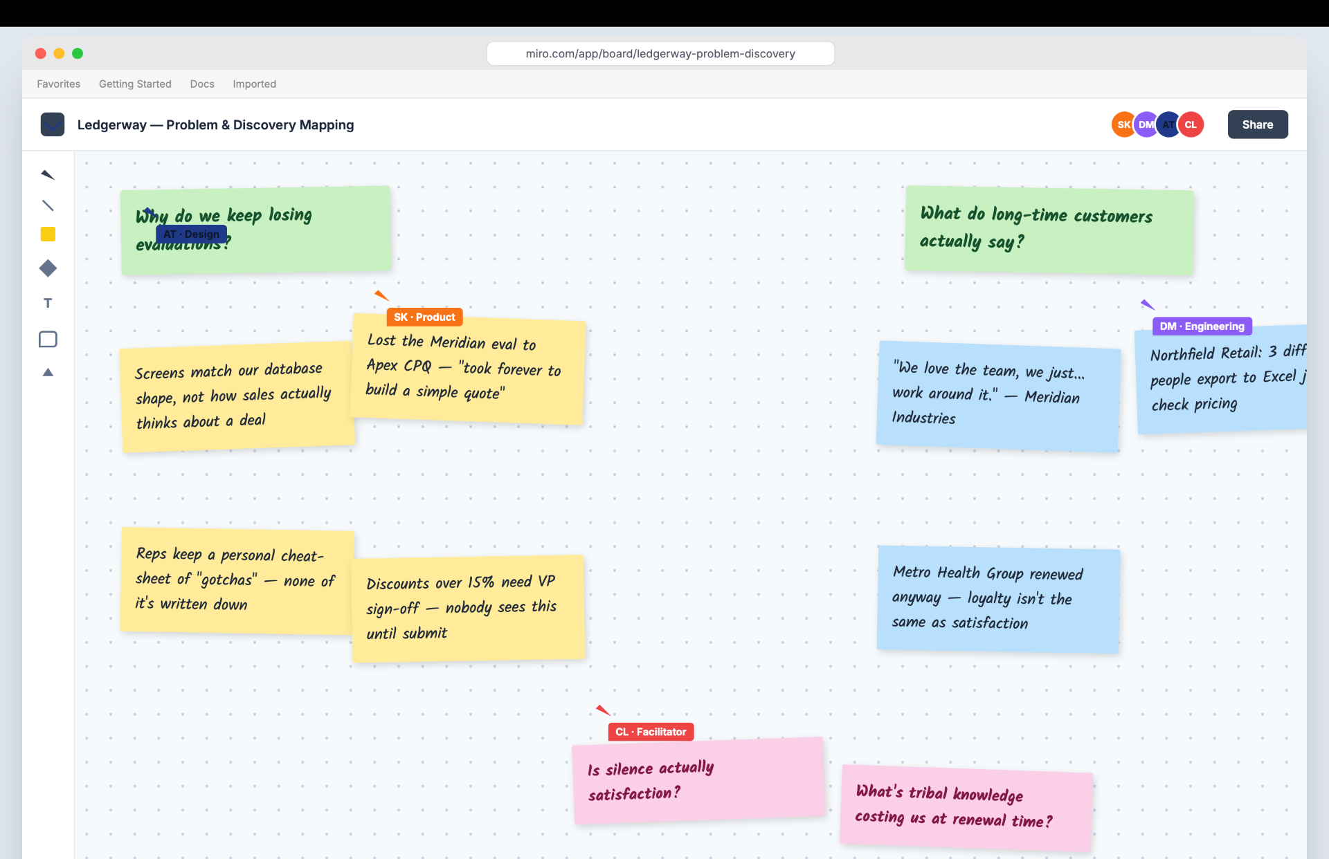
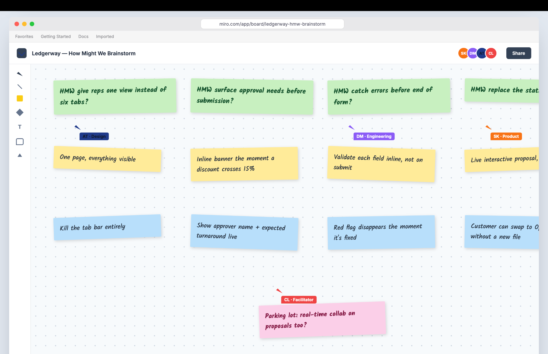
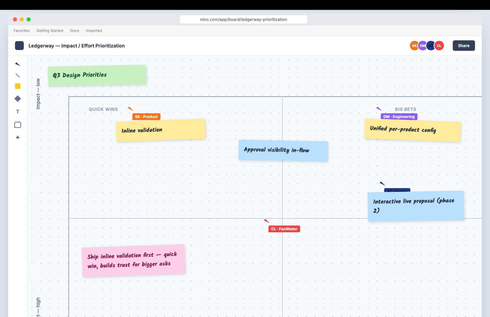
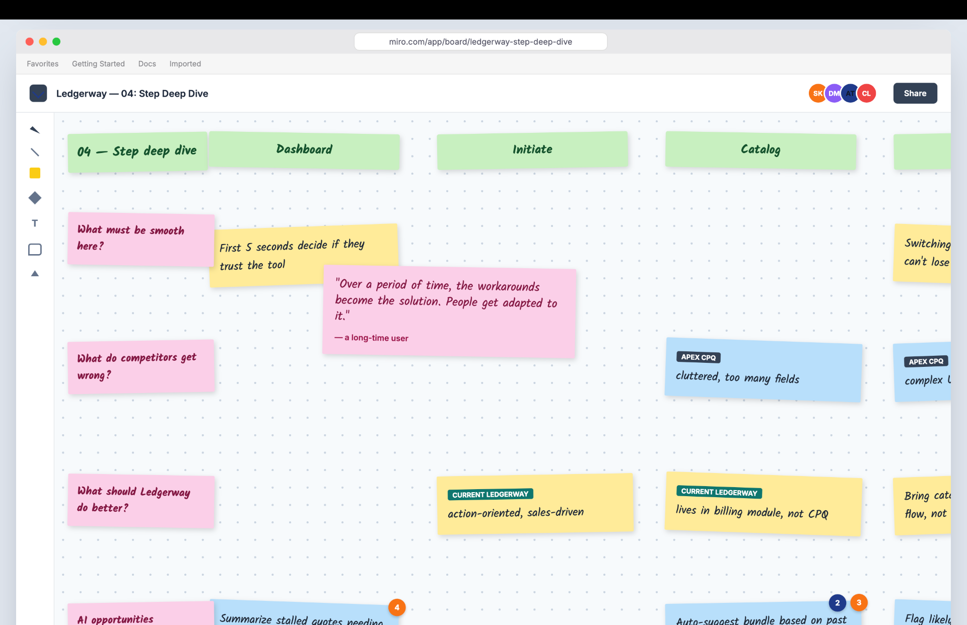
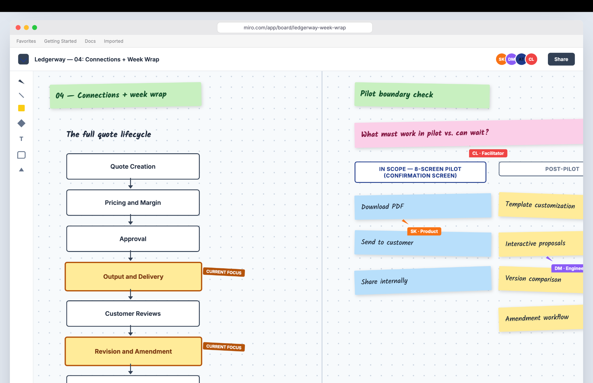
Our exercises were built to move people from being presented to into building something. A walk-the-walls read of the evidence. A ten-minute paper-bridge build that got competitive fast. A scoring instrument where each function weighs the work differently on purpose, because the place where product and engineering disagree is the conversation, not a number to average away.
What came out was a line the whole room could stand behind: the product should hold up on its own and carry its own work, so the value lives in the system and scales past the people. Two framings were banned by design. Never "free the team." Never "replace the team." The frame was the product growing up.
“You raise it, it drops into some void, and you've no idea if anyone's looking at it.”
This is also where product and customer success stopped being two departments. The room saw that adoption is a communication problem as much as a design one, and a whole category of work, from closing the loop on a ticket to preparing people for change before it ships, landed under joint ownership.
We turned every finding into a decision
Discovery hands you a pile of problems. The work is deciding what each one actually demands, out loud, so the design has something to answer to. We set a small number of principles, and every one points back at something we watched happen.
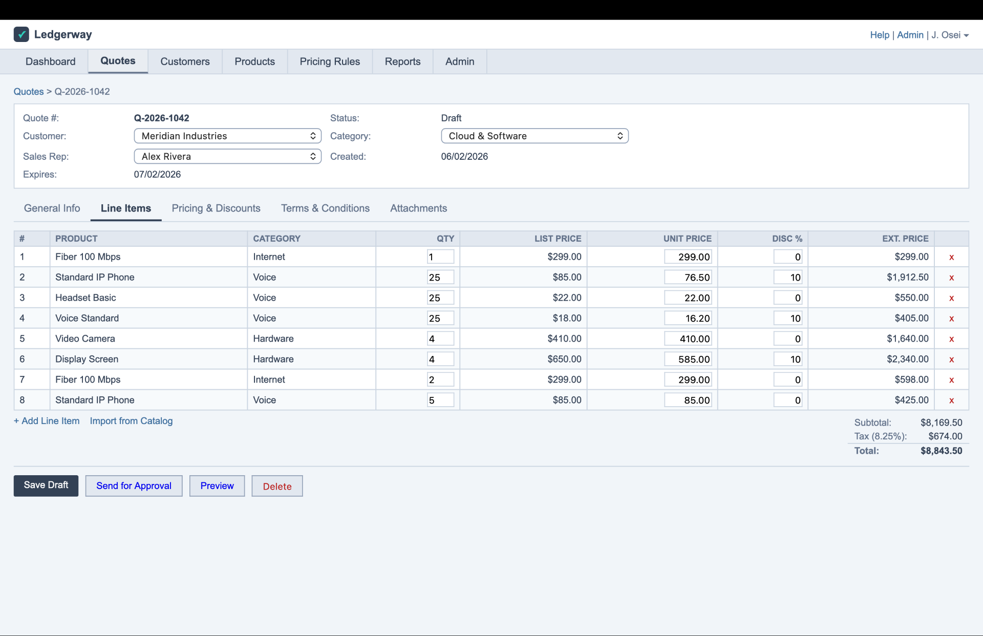
People filled a hundred fields and found out at the very end that one was wrong. So validation moved to the moment of the mistake: warn on the spot, never block, never lose work, save as you go.
“I fill in the whole form. It waits until the very end to tell me one field was wrong.”
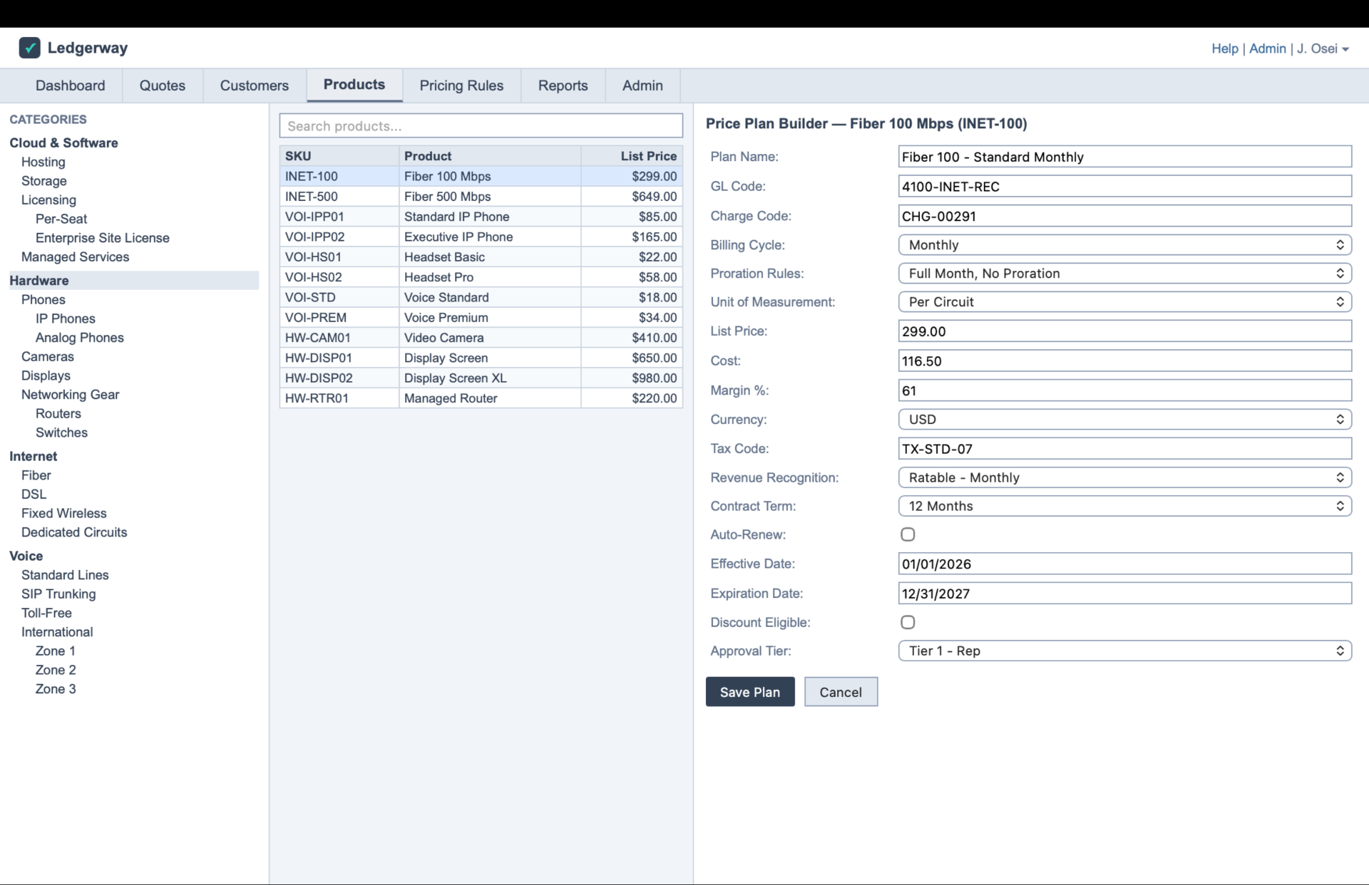
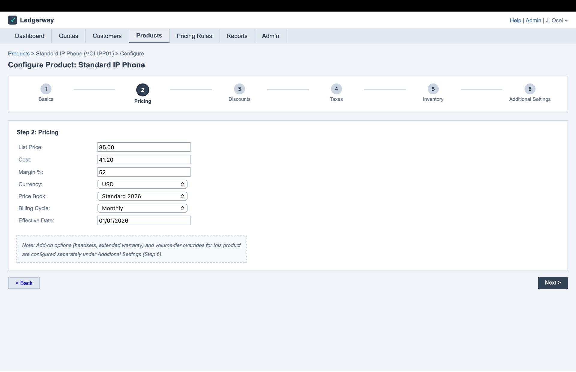
Configuring one product meant clicking across five or six sections, with add-ons stranded downstream after you'd mentally left the product behind. So everything about a product now lives in one place, finished before you move on.
The same quote had to mean different things to a reseller, a country entity, and the parent. So the components carry one structure and different data, rather than locking people out by role.
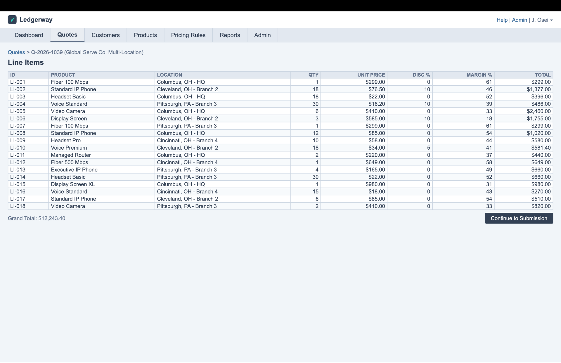
People exported thousand-line quotes to a spreadsheet just to read them. So we treated every workaround as a design failure, and a research finding, and designed the review the spreadsheet was standing in for.
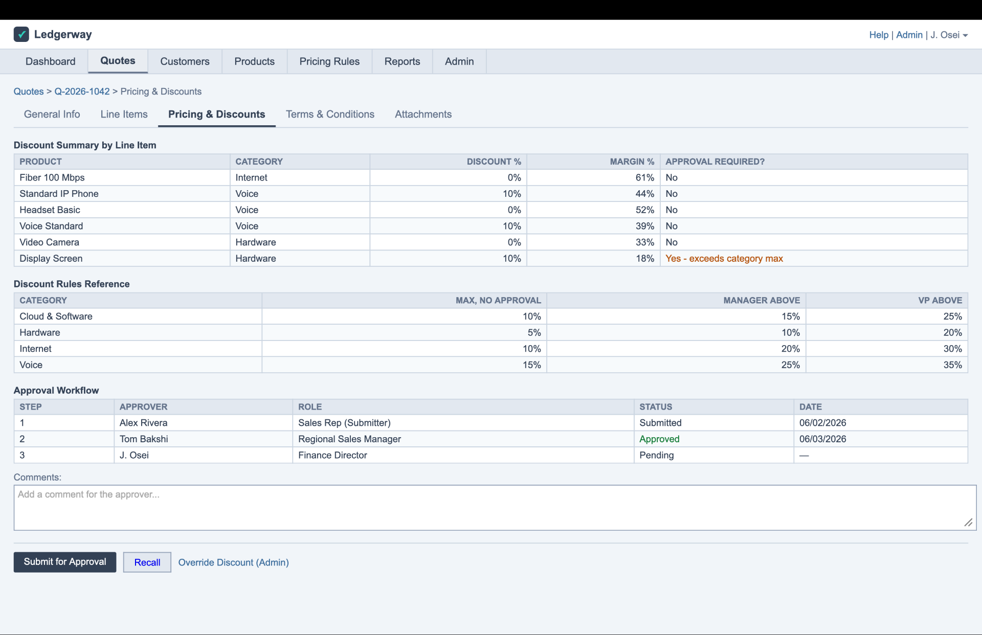
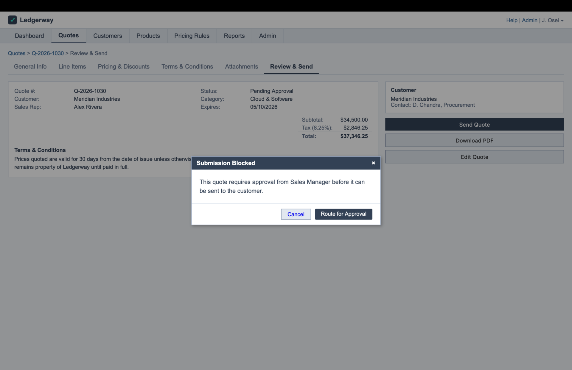
Approvals ambushed people at submission. So what triggers an approval, and where a quote sits, is visible before the end of the flow, not sprung at the end of it.
And the small misreads carried as much weight as the big ones. Every tester read the word "Approved" differently. A slider that set a value looked like one that only reported it. Nothing confirmed an item had been added, so people were never sure it had worked. None of that is cosmetic. Each one is a spot where the product was quietly spending someone's confidence, and each got designed, not decorated.
Four shifts hold the whole thing together: validation from gatekeeper to guide, rigid steps to context, a data dump to role-aware mission control, and a static document to a live workspace.
We built the argument instead of describing it
Round one was two working prototypes, not two visual options. One was control-first, where the user drives everything explicitly. The other was intelligence-first, where the system leads and the user corrects. We built both, because the client had never said where on that line they sat, and asking directly wasn't producing an answer. Showing them did. The response collapsed the two into a hybrid with one organising idea: the user drives, but never drives blind.
Beyond visual updates, we needed a change in discipline. The vendor had previously redesigned a screen, but users refused to switch, and both versions were still running side-by-side. The lesson was clear: a better interface isn't enough. Without a safe way to 'undo,' users see change as a risk and stay put. So, we designed for muscle memory: prioritizing 'undo' over confirmation, keeping familiar shortcuts, and only introducing bold changes where they provided clear value, while leaving critical habits untouched.
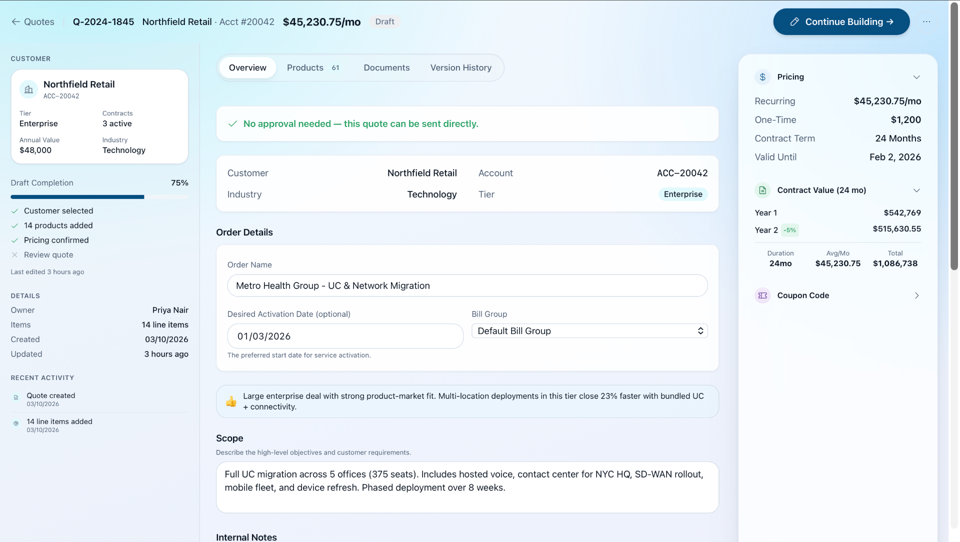
The most impactful change was in the way we handled quotes. Old quotes were sent as static PDFs, creating a tedious cycle of new attachments and email threads with every change. We replaced this with a live, shared workspace.
Now, customers can ask questions, request edits, and approve or reject items directly within the quote, turning a disjointed handoff into a seamless collaboration. For our power users, we prioritized speed: a keyboard-first design allows full navigation in just a few keystrokes, ensuring we never slow down those who rely on this system all day.
We tested the hybrid with four real users on a live prototype, watched where it still tripped them, tuned it, and tested again.
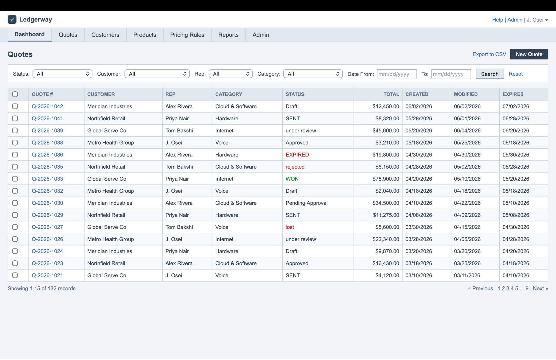
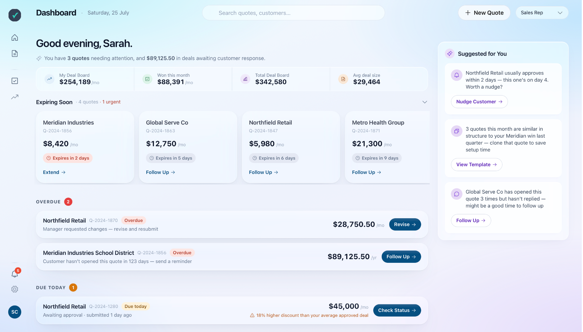
Everyone saw everyone's quotes. Now you see your work and what needs action.
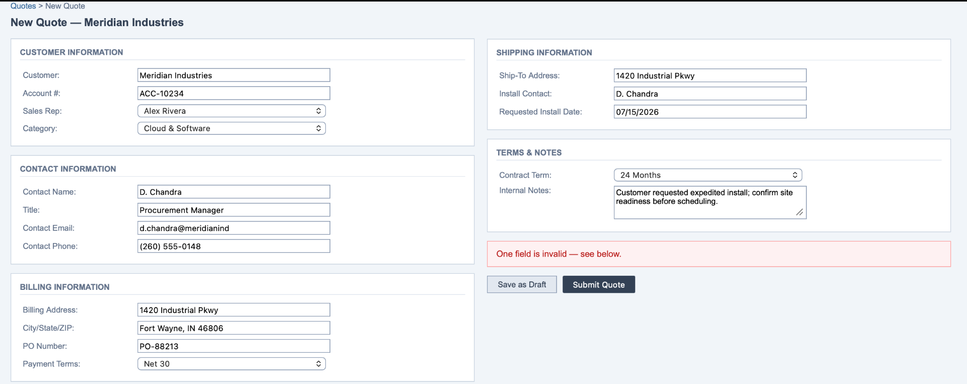
Validation ambushed you at submit. Now it warns as you go and never eats your work.
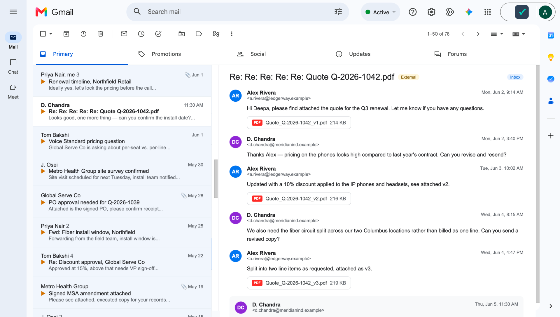
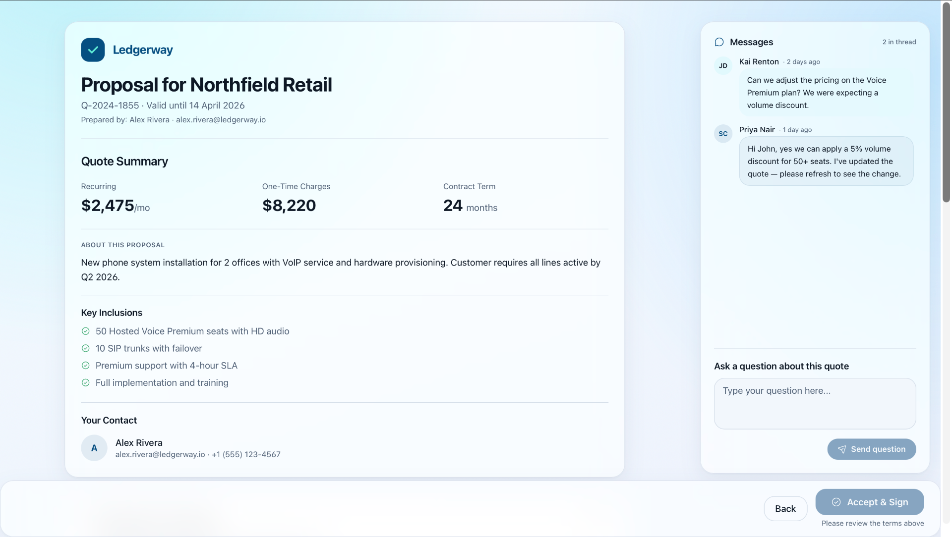
The quote left the system as a PDF attachment. Now it's a workspace the customer can act on.
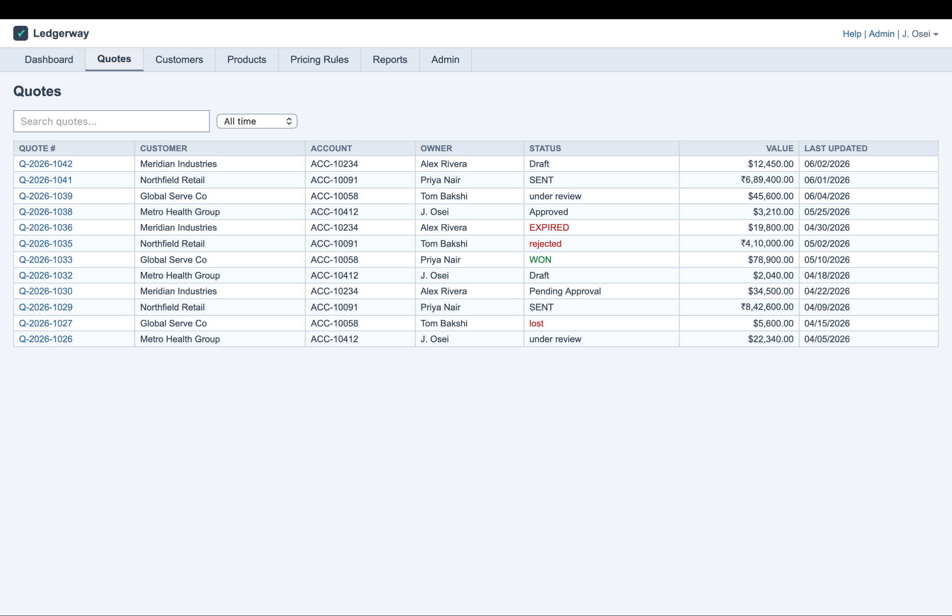
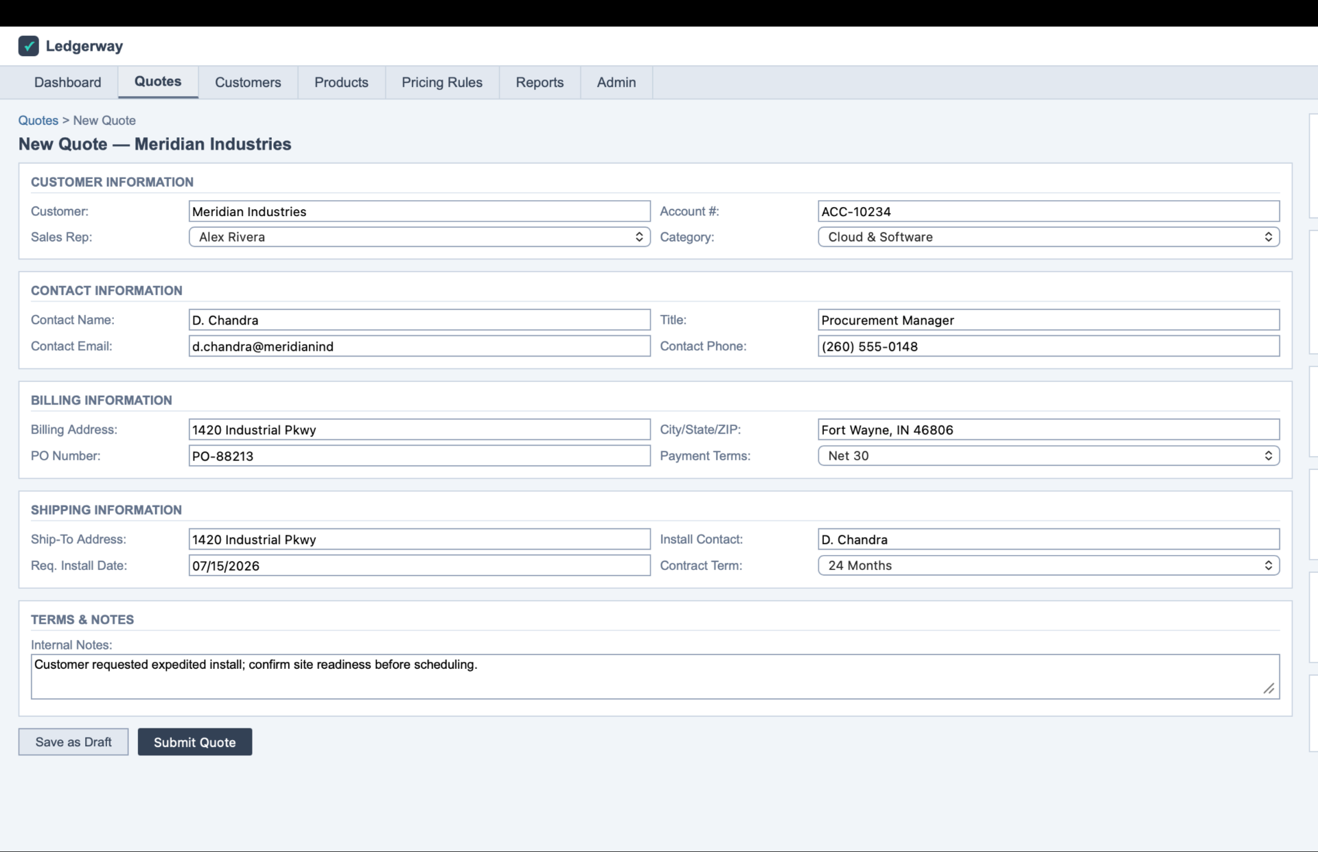
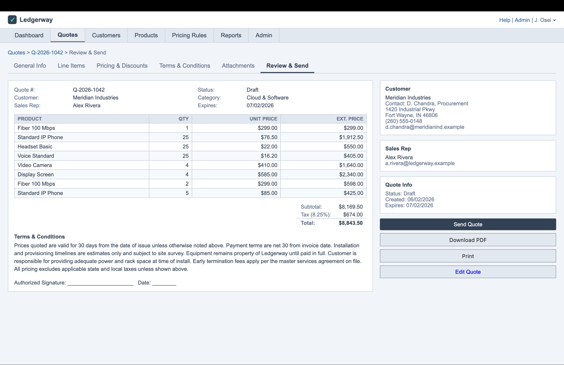
Ambitious and readable, instead of picking one
“We're tired of flat screens that look like someone dumped a stack of fields on them.”
They requested a 'glass' aesthetic, but that struggles with the dense data common in enterprise software. We realized they weren't asking for decoration; they wanted 'depth and separation' to organize information better. Information density was valued over minimalism. We designed an interface with depth and subtle glass elements, paired with the clear, high-contrast typography they admired in their preferred tools. It achieved a balance: visually striking, but readable at scale.
Enhancements that stay sustainable, not a rewrite
We worked close with development the whole way, sorting what was doable now from what needed building, so the enhancements stay sustainable instead of turning into a rewrite. The fragmentation was at the surface, not in the foundation, which is exactly why it was fixable without tearing out the core underneath. The pricing engine existed but was tangled with billing, so it got decoupled. The approval engine was barely there, so it got built properly, region-aware. Config options load at runtime instead of being hardcoded, so a change propagates without a front-end release. Create, edit, and amend are one screen set behind a mode flag, not three parallel builds. And the handoff classified every section as ready, ready-with-caveats, or not ready, so the build could start on the safe two-thirds.
The same clarity a person needs is what an agent needs
This part came from the chief executive, not from us.
“More and more customers want a headless setup. They want to work through agents and APIs, not just a screen.”
Here is why it fits so cleanly. An agent doesn't read a screen. It calls a capability. And for that to work, capabilities have to be discoverable, cleanly named, recoverable when they fail, and honest about their state. That is the exact same list as the human legibility problem we'd been solving for the person the whole time. So every near-term fix that makes the product clearer for a human is also a down payment on being ready for the agent. One investment, not two.
The screens were the part everyone could see. The real work was giving the product enough backbone to carry what the people had been carrying alone, so the next time the person who knows the machine walks out the door, the machine keeps running without them.
They already shipped with us
Ready to turn 11%
adoption into 68%?
Thirty minutes. We will tell you what is actually broken, and whether we are the right people to fix it.
We've told people to build internally when that made more sense.
We named it that for a reason.